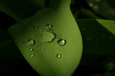
 i have done alot of photagraphy such as this, and i plan on putting it in the booklet, and whatever is left, onto the website.
ok so i am having trouble decieding what i want to use for a cover, and i would like to get a second opinion from the class. i took these pictures the other day and touched them up a little bit, and i was thinking about using one of these. but also i kinda want to go with my original idea with the band on the cover siloueted against the sun. i am doing a photoshoot with the band tonight to get the rest of the images needed to finish the project. but i would like an opinion on the cover, likes, dislikes ect. let me know please. my favorite is the dark one with the sunlight touching the leaf. i am still going to add the words mornindew to the cover as well.


Beautiful images! To keep your branding, I encourage you to repeat some of the photographs on both the CD and the Web-site (each can be modified, but I think it really helps to see similar images on different venues).
ReplyDeleteAs for the silhouette, I guess my subject comment is that I see that treatment a lot... What if the silhouette is visible through a large dew-drop? I know that it would be PhotoShop trickery, but I think it would work. Are you able to check-out a super-close-up lens? I have no idea if we even have one, but I've seen other students produce super detailed shots (that could easily give you a usable dew-drop). Talk to your cohorts!
i actualy have a very large lens i can put on my camera, that will get me the same effect.i will play with it and see what i get. thanks.
ReplyDeleteDude i think you should somehow incorporate the bands name inside the water droplete like make it look like water you could probably use maya nto sure how but ask charollete that.
ReplyDelete